Predicting Hospital No-Shows using Neural Networks (Coding Exercise)
Approximately 20% of medical appointments that are booked are not attended in the UK. This costs an estimated £1 billion annually. If we were able to predict who might not show up, we could take targeted measures to encourage them to do so, such as tailored text alerts or a quick phone call. Let’s try and use machine learning to predict who might not show up to their appointment.
Note: a notebook accompanying this exercise is available here. This provides the “model answer”; depending on level of experience, you may wish to use the notebook or to code independently.
Pre-Requisites
Ensure that you read this starter tutorial to learn the basics of Colaboratory and how to navigate around files, and the interface. We’ll be using Colaboratory for our code so we won’t need to download anything.
Stage 1 - Getting the Data
Let’s begin by starting a new Python 3 Notebook in Google Colab.
We also need to download our data, which you can do by clicking here.
You can unzip it on your computer, and you should see a file ‘KaggleV2-May_2016.csv’. That’s the file we want.
(Note: sometimes they release a new version of the data with an updated name – if this happens you will have to modify either the file name or the code commands we use below)
Let’s upload this csv file into Google Colab. On the left, click ‘Files’, then select ‘upload’ and upload our csv file. It’s a large file, so may take a while. Keep an eye on the orange circle at the bottom left.
Now let’s change into the main directory using ‘cd../’.
And finally, we’ll upload our data into a data-frame using ‘pd.read_csv(‘KaggleV2-May-2016.csv’)’:
noShows = pd.read_csv('KaggleV2-May-2016.csv')
Stage 2 - Understanding the Data
It’s good practice to first examine the data before performing further analysis.
This can take the form of visually inspecting the data itself, as well as plotting graphs.
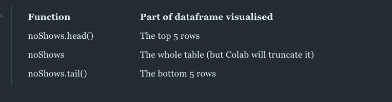
Thankfully, we have some handy functions for looking at different at different parts of the dataframe:
Stage 3 - Tidying and Preparing the Data
Now that we’ve had a look at the table, do you notice anything?

Firstly, it’s clear that there’s a few spelling errors; “Hipertension” and “Handcap”. Let’s correct those with the following code:
noShows.rename(columns = {'Hipertension': 'Hypertension',
                         'Handcap': 'Handicap'}, inplace = True)
We can check that’s worked by examining the column names (noShows.columns) or looking at the top of the table again (noShows.head()).
Let’s also drop the ‘PatientId’ and ‘AppointmentID’ columns, as they aren’t telling us much:
noShows.drop('PatientId', axis=1, inplace = True)
noShows.drop('AppointmentID', axis=1, inplace = True)
Anything else you’d like to change?
Well, some of the formatting is not in the friendliest; whether or not someone was a ‘No-Show’ is currently recorded as ‘Yes’ or ‘No’. This is easy for humans to interpret, but computers prefer a nice ‘1’ / ‘0’ binary.
We can change it using:
noShows['No-show'] = noShows['No-show'].map({'Yes':1, 'No':0})
The same goes for gender:
noShows['Gender'] = noShows['Gender'].map({'F':1, 'M':0})
Have a look at the table yourself and see if there’s any other changes you’d like to make.
Screening for missing values and outliers
Data quality can vary significantly, and one thing worth checking for is missing data.
In computing terminology, these values may be recorded as ‘NaN’ - Not a Number.
We can check for these using the .unique() function, which will show us all the unique values within our table.
For example, calling the following code
print('Handicap:',noShows.Handicap.unique())
will show us all the values contained within the ‘Handicap’ column:

Trying calling this function for the remaining column names.
This function is also useful for identifying potential outliers within the data.
Setting data types
Another important thing for us to do before commencing analysis is to set the correct data types.
For this we can use the function .apply(np.[select a datatype])
For example, our columns ‘ScheduledDay’ and ‘AppointmentDay’ are currently ‘object’ types but they should be ‘datetime’ types.
We can check current datatype with:
type(noShows.AppointmentDay[0])
And we can update to our desired datatype with:
noShows.AppointmentDay = noShows.AppointmentDay.apply(np.datetime64)
noShows.ScheduledDay = noShows.ScheduledDay.apply(np.datetime64)
For the purposes of this walk-through, we will only look at the date that the appointment was scheduled on, and not the time that it was scheduled. For that we use the following code:
noShows['WaitingTime'] = pd.to_timedelta((noShows['AppointmentDay'] - noShows['ScheduledDay'])).dt.days
noShows['WaitingTime'] = noShows['WaitingTime'].apply(np.int64)
Creating new columns
We should also look at our table and decide if there are any new columns that we want to add.
Sometimes this will be combinations of other columns, and other times you may want to add what are called ‘dummy variables’.
In our case, it would make sense to create a column for ‘Waiting Time’ which takes into account the time difference between the day the appointment was scheduled and the day they had the appointment.
This will be much easier for the algorithm to analyse, and is likely to produce a better result.
We can do this with the following code:
noShows['WaitingTime'] = pd.to_timedelta((noShows['AppointmentDay'] - noShows['ScheduledDay']))
    # Turn into into the 'int' datatype, to enable analysis by the algorithm
noShows['WaitingTime'] = noShows['WaitingTime'].apply(np.int64)
This will create a new column ‘WaitingTime’ which will equal the difference between the two dates.
Stage 4 - Training the Model
First we’ll select the variables to use in our model:
prediction_var = ['Gender','Age','Scholarship','Hypertension','Diabetes','Alcoholism','Handicap','SMS_received','WaitingTime']
Once your model is working, feel free to come back here and play around with including different variables.
We’ll then divide our data into ‘training data’ and ‘test data’. It’s important to keep some data aside (the test data), so that we can test our model on data it hasn’t seen before.
 # This sets 15% of our data as the test data, and random selects which data points they will be
 train, test = train_test_split(noShows, test_size = 0.15)
Now we’ll divide our data into the variables the model will use for training (the “x values”) and the output (the “y values”) - here the output is whether they attend or not.
train_x = train[prediction_var]
train_y = train['No-show']

test_x = test[prediction_var]
test_y = test['No-show']
Training a neural network
Let’s use a neural network from scikit-learn, which we can call as follows:
from sklearn.neural_network import MLPClassifier
model = MLPClassifier(solver='lbfgs', alpha=1e-5, hidden_layer_sizes=(5, 2))
Feel free to read the documentation and modify the parameters within our model.
We’ll fit it to our data:
model.fit(train_x, train_y)
And then use it to generate a prediction:
prediction = model.predict_proba(test_x)
For each data point in our test set, this gives a probability it is in class one (attended) vs class two (did not attend).
We can look specifically at the probability of not attending with the following:
proba_predict = prediction[:,1]
Now we have trained our model and used it to predict who from our test set will not attend. Let’s look at how well it performed.
Stage 5 - Assessing performance
The best way to assess our performance is to plot an ROC curve and find the AUC (which are explained here).
import sklearn.metrics as metrics

fpr, tpr, threshold = metrics.roc_curve(test_y, proba_predict)
roc_auc = metrics.auc(fpr, tpr)

plt.title('Receiver Operating Characteristic')
plt.plot(fpr, tpr, 'b', label = 'AUC = %0.2f' % roc_auc)
plt.legend(loc = 'lower right')
plt.plot([0, 1], [0, 1],'r--')
plt.xlim([0, 1])
plt.ylim([0, 1])
plt.ylabel('True Positive Rate')
plt.xlabel('False Positive Rate')
plt.show()
This will produce a graph showing how well our model distinguishes between attenders and non-attenders and different thresholds.
Using the variables described above, this should provide something like this:

This is a weak-to-moderate AUC score, but that’s to be expected as we didn’t use too many variables in our model!
Summary
- Predicting an output (such as attender vs non-attender) is known as a classification task. There are many options for performing such a task; one popular method is the neural network.
- It’s important to modify real-world data to a format ready for analysis. This includes removing useless information, checking for missing values and outliers, and converting data into a ‘computer-friendly’ format (often a binary 0/1).
Next steps
In early 2019, a research group in London did precisely the above, but using many more variables (>80) and with multiple different types of algorithm.
Their best performing algorithm, an AdaBoost model, achieved an AUC of 0.848.
It’s a fantastic paper published in Nature Digital Medicine, and is well-worth a read here. I’ve written a brief summary of the paper here.

Some optional next steps with our code:
1. Training alternative models and comparing the performance with our network.
Some suggested alternative classifiers to use are:
- Random Forest
- Logistic Regression
- Nearest Neighbours
- Support Vector Machine
Use the scikit-learn documentation in order to call the appropriate model.
2. Creating neighbourhood dummy variables
At the moment, our model is not utilising the column ‘Neighbourhood’.
One way that we could incorporate those variables is by creating ‘dummy variables’ for each neighbourhood.
Pandas has a convenient code to allow us to do this:
dummy_cols = ['Neighbourhood']
noShows = pd.get_dummies(noShows, columns = dummy_cols)
However, this gives us about 80 extra columns, for the 80 different neighbourhoods, so it up to us whether this is something that we want to do.
We will also need to modify our code to include these variables when training the model.
3. Remove outliers
Note that when we looked at range of ages, there was a least one major outlier - an age of -1 years old! How might you remove this from our dataset? Have a go at writing some code for doing so.
4. Quantifying the impact of different variables on our model
We won’t give you any guidance on this, but see if you can work out how!