Why custom AI review dashboards transform AI products - and how to build one
Without metrics on performance of your AI product, you’re flying bind. You don’t truly know how your app is doing nor how you could improve it. Performance could drop and you won’t know until your customers have already started leaving, by which point it’s too late.
One of the most effective ways to monitor AI performance is through human reviews of AI outputs and one of the best ways to empower fast and effective human reviews through a custom review dashboard. This provides the raw data and insights that drive product development. This is doubly important for vertical AI applications where domain experts act as “translators” between product usage and AI performance.
A review dashboard should optimise for three things by following three principles:
- High quality reviews -> Principle 1: Optimise surfacing all required context, as clearly as possible
- Minimise time per review -> Principle 2: Optimise the review flow sequence
- Generate actionable data -> Principle 3: Design the reviews to give you the data you need
In this article I’ll demonstrate each of these principles using examples from building “Scalpel”: the domain expert review dashboard we built at Anterior to enable a small team of clinicians to review >100,000 medical decisions.
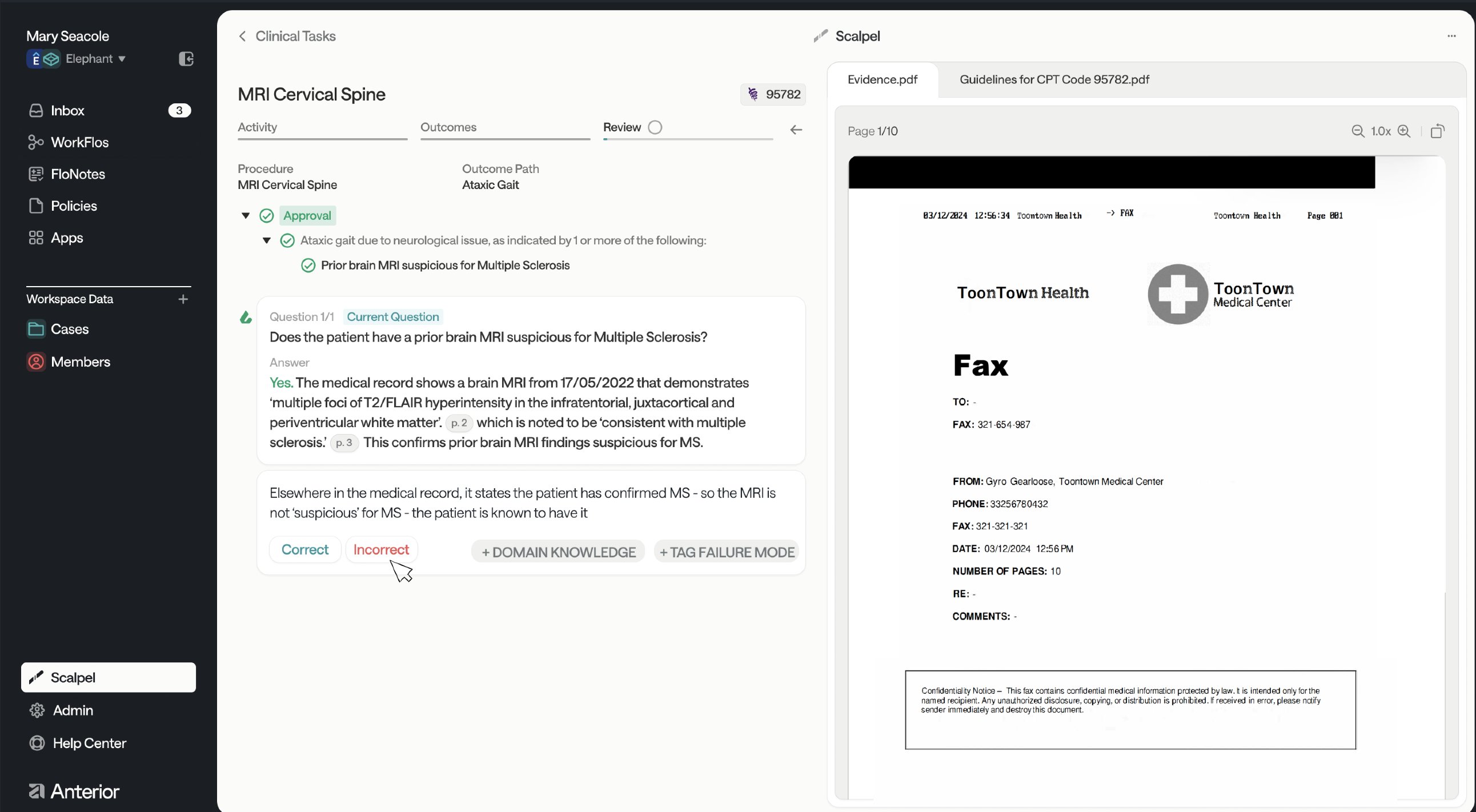 |
|---|
| Scalpel - the review dashboard we built at Anterior |
Why build a custom UI? Can’t I just use spreadsheets or existing tools?
The best UIs enable human reviewers to:
- review AI outputs (with all the necessary context)
- specify how the AI has failed
- suggest improvements to the AI system
Using spreadsheets or tooling providers is a potential starting point, but you’ll quickly hit limits and need to migrate to your own. They restrict the kinds of data views you can get (spreadsheets struggle when you want to examine intermediate steps, for example) and it’s hard to directly translate review outputs into application improvements.
Principle 1: Optimise surfacing all required context, as clearly as possible
For humans as with LLMs, context is key. To support high quality and efficient reviews, you want to minimise the amount of context switching that your domain expert reviewer needs to perform.
Make all possible relevant context available. This includes intermediates of an LLM trace (if it’s a multi-step process). If there are other sources that reviewers often refer to, try to bring that in too. For example, we noticed nurses often look up medical definitions in a different tab, so we added an expandable sidebar for them to do that within the review flow.
But don’t present it all at once. You want the context to be available but you don’t want to overwhelm the reviewer. Use nesting, side bars, etc to abstract away context that they might want, but typically don’t. Invest time mapping out the typical review flow (more on this in Principle 2) so that you know what context to surface and at what point.
Grouping different kinds of context can help. At Anterior, our clinical reasoning workflows check medical guidelines against medical evidence to decide whether a treatment should be approved. We decided to put the two main pieces of context (guidelines and evidence) on one side of the screen, and all AI output information on the left hand side. Our clinicians reported this enabled a clean mental separation: context on the right, to-be-reviewed on the left.
Principle 2: Optimise the review flow sequence
The quality and speed of reviews is heavily influenced by the review flow sequence. So it’s worth investing time upfront to think this through and continuing to iterate on it too.
I’d recommend that you design the review flow from the ground up rather than anchoring too much on existing flows (if they exist). At Anterior, we found that all nurses and doctors have their own workflows for the health administrative tasks we’re automating; their own “way of doing things” that became habit over time. We also found these workflows varied widely (with some presumably being more effective than others).
We considered this different approaches then created our own opinionated take on what a review should look like. E.g. one opinionated flow is: “read short summary of case for context -> understand the question the AI was asked -> see the relevant context in medical record -> review the AI output”. We then designed our review interface to support that.
You should aggresively reduce friction in the review flow. Friction contributes to reviewer fatigue, slower reviews and lower quality output. We spent a lot of time shadowing our reviewers using the dashboard to identify and fix pain points in their process:
- too much scrolling? -> bring the information to where the user is
- too much clicking? -> add keyboard shortcuts
- too many options? -> show only the first decision to be made, then surface the subsequent decision afterwards
- unclear where they are in the review? -> add a progress indicator to help them anchor themselves
The ideal flow is also closely related to what sort of data you want to collect from the review process, which I’ll now discuss in Principle 3.
Principle 3: Design the reviews to give you the data you need
The entire purpose of a review dashboard is to generate data that is helpful in improving your LLM appplication. Therefore, it’s important to ask “what kind of information would be helpful?” and “therefore, what does my review output need to look like?”
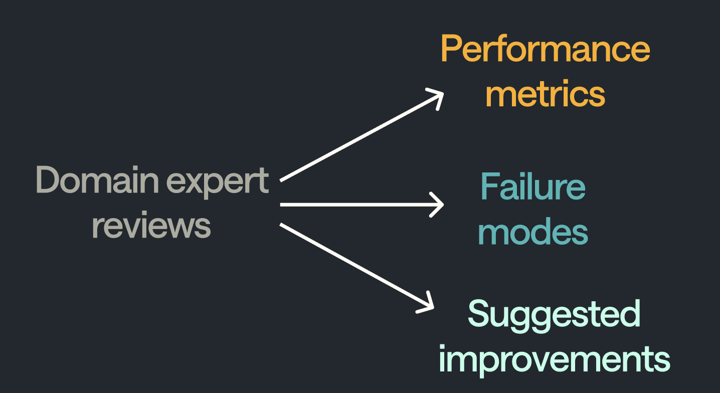
The first and most obvious thing is correctness of the LLM. Knowing how you’re performing in prodution is very valuable. You can segment this performance breakdown along axes of interest, such as type of user query. But you want more than that.
Identifying failure modes tells you in what way your LLM pipeline is making mistakes. This lets you both focus efforts on improving it and quantify the impact of those improvements (by re-testing on failure mode cases). Work with domain experts to create an initial failure mode taxonomy. Then include a free text box as well to enable suggestions for new failure modes.
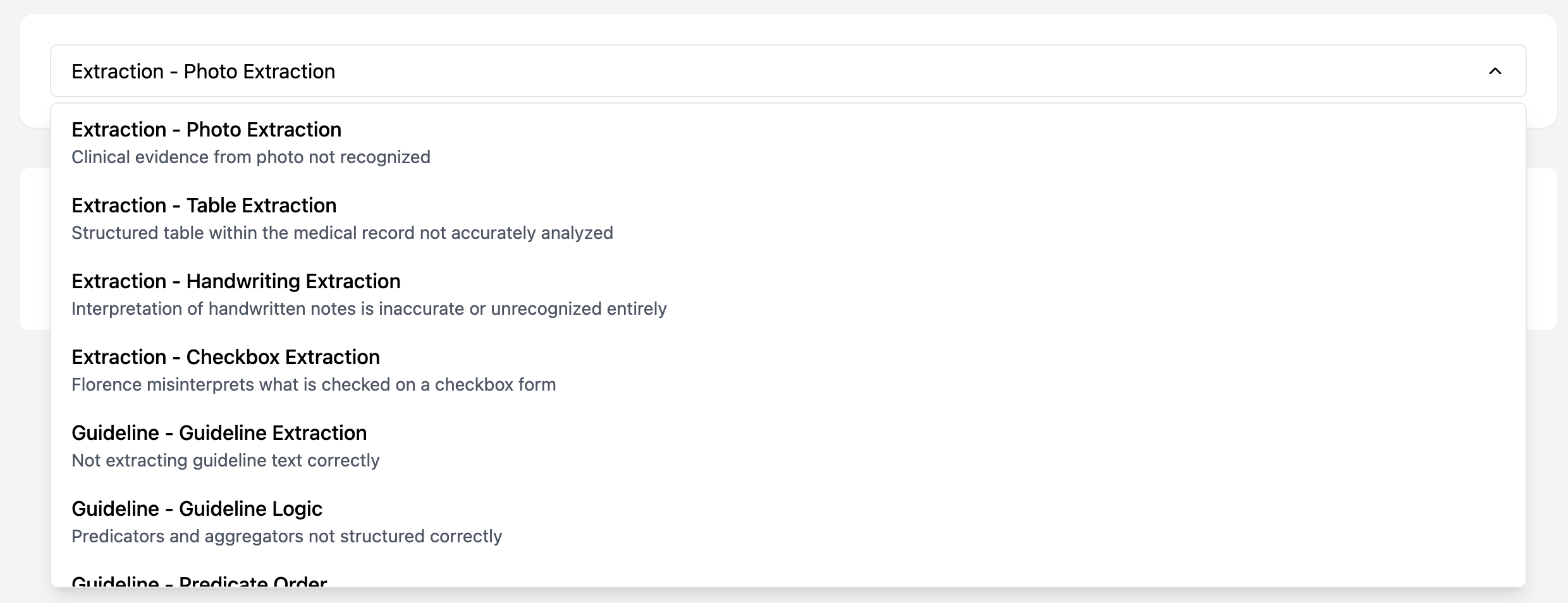 |
|---|
| Selecting the Failure Mode from a dropdown menu |
Correctness and failure modes help you characterise performance. But you can go a level beyond, and directly ask for suggestions for improvement and potentially even make those improvements directly (e.g., by tweaking prompts or adding content to a knowledge base). It’s great to do this during the review flow, as you minimise lost context between separate “review” and “improvement” phases. It significantly increases the leverage of your domain experts.
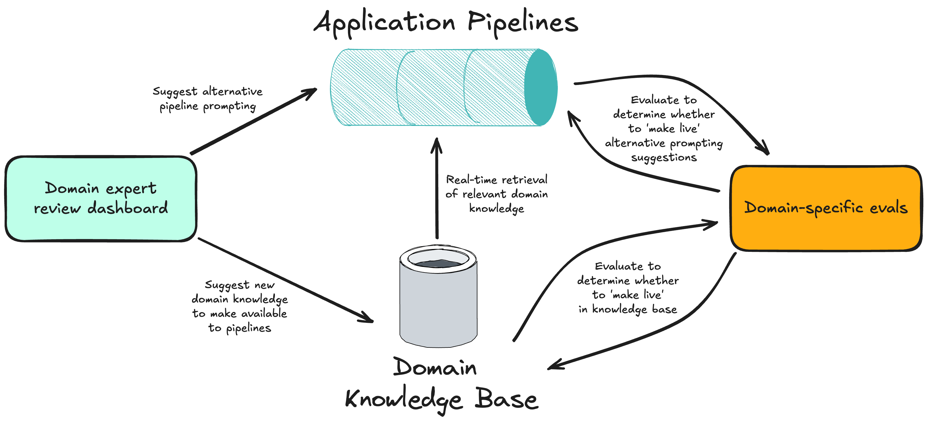 |
|---|
| Translating human reviews into AI system improvements |
Other helpful data outputs from reviews might include:
- tagging a case to be added to a ‘regression dataset’ (which can be run in CI)
- filing a bug report with prefilled trace details
Summary
A domain expert review dashboard is one of the highest leverage things you can build for improving your LLM product. It provides a critical bridge between production data and application improvements, powered by domain expert reviewers.
The three principles outlined enable you to achieve the three objectives for your review dashboard:
- To enable high quality reviews as quickly as possible -> Optimise surfacing all required context, as clearly as possible (Princple 1) and Optimise the review flow sequence (Principle 2)
- To get actionable insights from your data -> Design the reviews to give you the data you need (Princple 3)
P.S. Building the dashboard doesn’t need to be a huge lift. You can pretty far by ‘vibe coding’ your initial interface then iterating. See this video for a demonstration of what that could look like.
Comments powered by Disqus.